

728x90
반응형

패럴랙스 스크롤링 (parallax scrolling) css로 구현하기
패럴랙스 스크롤링은 마우스 스크롤링에 따라서 웹에 여러가지 효과를 주기 때문에 유동적인 사이트를 만들때 많이 활용하는 기법인데요.
패럴랙스는 관련 js 소스도 많이 나와있어서 활용이 용이하지만 오늘은 그보다도 간단한 CSS를 이용해서 패럴랙스 효과를 줘보려고 합니다.
바로 background-attachment:fixed; 로 백그라운드를 고정하고, 그위에 텍스트나 이미지 등을 올린다면 하단의 백그라운드라 올라올때 시각적으로 패럴랙스 스크롤링 효과를 주는 것인데요.
예제 소스는 아래에 첨부하도록 하겠습니다.
<style>
    * {margin: 0; padding: 0;}

    h1 {margin: 0; font-size: 20px; font-weight: bold;}
    h1:after {display: block; width: 200px; margin: 20px auto; content: 'parallax scrolling'; border-bottom: 1px solid #fff;}
    header {color: #fff; max-width: 100%; position: relative; top: 50%; left: 50%; transform: translateX(-50%)translateY(-50%); text-align: center; font-weight: bold;}

    .scene {display: block; position: relative; width: 100%; height: 100vh; background-repeat: no-repeat; background-attachment: fixed; background-size: cover;}
    .scene.one {background-image: url('bg01.jpg');}
    .scene.two {background-image: url('bg02.jpg');}
    .scene.three {background-image: url('bg03.jpg');}
</style>


<body>
    <div class="scene one">
        <header><h1>01 .</h1></header>
    </div>
    <div class="scene two">
        <header><h1>02 .</h1></header>
    </div>
    <div class="scene three">
        <header><h1>03 .</h1></header>
    </div>
</body>
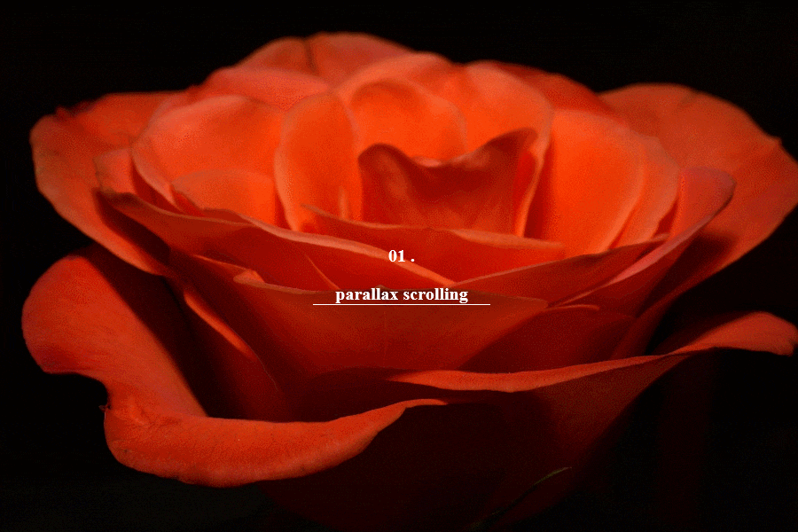
위의 소스를 적용한 화면은 아래 이미지를 참고해 주세요.
728x90
반응형
'공부 > html, css' 카테고리의 다른 글
| 툴팁넣기 : css만 사용하기 (tooltip) (0) | 2023.01.09 |
|---|---|
| 레이아웃 잡기 : 다단 멀티컬럼 (multi column) (0) | 2023.01.09 |
| flex 로 레이아웃 정렬하기 (0) | 2023.01.09 |
| grid 로 레이아웃 잡기 (0) | 2023.01.09 |
| 퍼센트와 픽셀 혼용 계산법 (calc) (0) | 2023.01.09 |


