


728x90
반응형

css만 사용해서 툴팁넣기
퍼블리싱을 할때 도움말을 넣어야할때 툴팁을 넣는 방법으로 alt나 title이 있는데, title을 사용하면 아무래도 소스가 정신없어지는 경우가 많아서 css만을 활용하여 툴팁넣는 방법을 포스팅 해볼까 합니다.
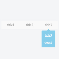
html 파일과 css 파일을 따로 정리해 올리고 결과값 이미지를 첨부하였으니 확인해 보시고 제일 하단에 참고 사이트에 가시면 라이브로 소스 수정과 테스트가 가능하십니다.
html
<div id="tooltip_wrap">
  <ul>
    <li tabindex="0">
      <a href="#" tabindex="-1">title1</a>
      <dl>
        <dt>title</dt>
        <dd>desc</dd>
      </dl>
    </li>
    <li tabindex="0">
      <a href="#" tabindex="-1">title2</a>
      <dl>
        <dt>title2</dt>
        <dd>desc2</dd>
      </dl>
    </li>
    <li tabindex="0">
      <a href="#" tabindex="-1">title3</a>
      <dl>
        <dt>title3</dt>
        <dd>desc3</dd>
      </dl>
    </li>
  </ul>
  <p>tooltip example...</p>
</div>
css
#tooltip_wrap {}

#tooltip_wrap > ul {
  padding: 0;}

#tooltip_wrap > ul:after {
  content: '';
  display: block;
  clear: both;}

#tooltip_wrap > ul > li {
  float: left;
  list-style: none;
  position: relative;
  padding: 5px 20px;
  background: #f9f9f9;
	cursor:pointer;}

#tooltip_wrap ul > li > a {
  font-size: 12px;
  color: #aaa;
  text-decoration: none;}

#tooltip_wrap dl {
  opacity: 0;
  z-index: -1;
  position: absolute;
  background: skyblue;
  bottom: -80px;
  left: 50%;
  transform: translate(-50%, 0);
  -ms-transform: translate(-50%, 0);
  -webkit-transform: translate(-50%, 0);
  padding: 10px;
  border-radius: 3px;
  -webkit-border-radius: 3px;
  -moz-border-radius: 3px;}

#tooltip_wrap dl:before {
  content: '';
  width: 0px;
  height: 0px;
  border-width: 5px;
  border-style: solid;
  display: block;
  border-color: transparent transparent skyblue transparent;
  position: absolute;
  top: -10px;
  left: 50%;
  transform: translate(-50%, 0);
  -ms-transform: translate(-50%, 0);
  -webkit-transform: translate(-50%, 0);}

#tooltip_wrap dl dt {
  text-align: center;
  border-bottom: 1px #fff solid;
  font-size: 12px;
  color: #fff;
  padding-bottom: 5px;}

#tooltip_wrap dl dd {
  padding: 5px 0 0;
  margin: 0;
  font-size: 12px;
  color: #f9f9f9;}

#tooltip_wrap ul > li:hover dl,
#tooltip_wrap ul > li:focus dl{
  opacity: 1;
  z-index: 1;
  transition: opacity 0.3s ease;
  -ms-transition: opacity 0.3s ease;
  -webkit-transition: opacity 0.3s ease;}
728x90
반응형
'공부 > html, css' 카테고리의 다른 글
| 패럴랙스 스크롤링 (parallax scrolling) (0) | 2023.01.09 |
|---|---|
| 레이아웃 잡기 : 다단 멀티컬럼 (multi column) (0) | 2023.01.09 |
| flex 로 레이아웃 정렬하기 (0) | 2023.01.09 |
| grid 로 레이아웃 잡기 (0) | 2023.01.09 |
| 퍼센트와 픽셀 혼용 계산법 (calc) (0) | 2023.01.09 |


